Wednesday, March 31, 2010

Add another to the pile of Use It or Lose It - a challenge to myself to use up older things in my stash.  The glittered flower has been sitting in my stash for too long. So, I pulled it out and created something around it.
I really, REALLY, really needed to make more scripture cards.  I haven't really had a chance to get the new to me plain jane bible verse from Verve inky.  So, you can imagine my excitement to work it in to this card.


Paper: Hibiscus Burst, Stampers Select White, Summer Sunrise (PTI)
Stamps: Plain Jane Bible Verse (Verve)
Ink: Hibiscus Burst (PTI)
Other: Plaid Picnic Impression Plate (PTI), Medium Scallop Die (PTI), Hibiscus Burst Ribbon (PTI), Glitter Flower (Portabello)

Thanks for looking!  As always, I greatly appreciate your comments and support. :)

Tuesday, March 30, 2010

Happy Birthday - Use It or Lose It

Another edition of Use It of Lose It - a challenge to use through some things that have been in my stash for ages


I have recently fell in love with the glitter strips that I learned from Nicole at Papertrey.  So, when I needed to use up a glittery butterfly sticker, I knew just what to pair it with.

Stamps: Polka Dot Basics, Damask Designs (PTI)
Paper: Hawaiian Shores, Enchanted Evening (PTI)
Ink: Enchanted Evening (PTI)
Sticker: Portabello
Other: Glitter - Sugar Coating (Doodlebug), Adhesive Tape (3L)

Monday, March 29, 2010

Thank You Very Much

This is another of my Use It or Lose It series.  This is a quick card that I whipped up in multiples.  I needed to use up the delightful circle paper.


The ink color was actually stamped with PTI's Hawaiian Shores.  When I first opened the pad, it was stamping a blue turquoise instead of green turquoise.  To salvage my die cuts and stamped frames, I reverted to my stash and was able to use up some of this ribbon.  Score!!  I used 2 things in my Use It or Lose It attempt.  Yeah!!

Stamps: Fillable Frames #2, Beautiful Blooms II (PTI)
Paper: Spring Moss (PTI), Designer Paper (Hobby Lobby)
Ribbon: Ribbons and Bows Oh My
Ink: Hawaiian Shores (pre-smooshing), Spring Moss, Enchanted Evening (PTI)
Other: Fillable Frames #2 Die (PTI), Picnic Plaid Impression Plate (PTI)

Sunday, March 28, 2010

Hybrid - Again - Finally!!


Today is a quick share.  It feel like forever since I shared anything hybrid (oh, it has been forever).  I typically sell all of the cards I make (or pretty close) and I cannot sell the hybrid one's.  So, I only make those in spare/free time.  :)  I guess lately that has been none.

Digital Kit: Sweet and Simple Life #3 (Weeds and Wildflowers)
Button: My Minds Eye
Ribbon: Hobby Lobby
Font: Honey Script

Saturday, March 27, 2010

Welcome Little One


Today I am sharing a fun little baby card that is gender neutral.  I LOVE Papertrey's Lemon Tart color.  It is a very yummy soft yellow.  I pulled out a sticker that I have been waiting to use (more Use It or Lose It).  This is the creation I made using Lemon Tart and the adorable giraffe sticker.


Stamps: Background Basics: Tin Types (PTI), Welcome Little One (Michael's $1)
Sticker: unknown (I took it out of the package over a year ago - opps!)
Paper: Bitty Dots - Lemon Tart, Kraft (PTI)
Ribbon: Michael's
Ink: Lemon Tart, Dark Chocolate (PTI)

Thanks for looking!  It is a pleasure to read all the great comments and fun feedback!

Thursday, March 25, 2010

Papertey Blog Hop - March 2010


Thank you for stopping by today.  I am participating in the Papertrey blog hop.  How fun!!  This month we were supposed to do something with buttons.  Oh my!  I am not a button person.  I cannot remember the last time I put more than one button on a project.  Ekk!  I pushed and pushed my creativity until I came up with this card.


This was such a fun card to put together.  The original inspiration came from a technique form Betsy Veldman.  She gave some great tips for dies.  She said to cover one in buttons.  When I read it, a light bulb went off.  I could surely cover a die cut in buttons, right?  Well, as it went together, the buttons on the die looked somewhat silly.  I scratched the card, but resumed when new inspiration hit.  Yeah!!  I love it when that happens!  :)  As it turns out, I was going to emboss the sentiment with white, but that darn quality ink from Papertrey REALLY shows up on kraft card stock.  So . . . I dug around and found this red.  This might be my first successful embossing - ever.  I love the look of the white embossed and have wanted to try it for a while.  Let me tell you that this red makes me want to do lots more embossing.

Stamps: Polka Dot Basics (PTI), Flowers ($1 stamps), Grass (Autumn Leaves), Birthday Wishes (SillyLeAnn 1.0 - yes, I make my own stamps)
Paper: Stampers Select White, Kraft, New Leaf (PTI)
Ink: Fresh Snow, Pure Poppy, New Leaf (PTI)
Die Cut: Serenade Cartridge (Cricut)
Ribbon: Hobby Lobby
Buttons: My Minds Eye
Embossing Powder: Pure Red (Ranger)
Floss: White DMC Floss

Wednesday, March 24, 2010

Use it or Lose It

I have been going through my craft stuff lately.  I have so much great stuff that has never been touched.  So, I am going to use it or lose it.  I will try to post some more of my use it or lose it stuff soon.


I started with this beautiful designer paper from Hobby Lobby.  I have no idea who it is by.  :)  Sorry.
Next, I pulled out my nifty color book and went to work.


I would have never thought of doing a card in these colors, but they are divine in real life.  So, off to creating . . .


This is what I came up with.   I used the designer paper on the background.  A strip of berry sorbet cardstock, a strip of brown grosgrain, and two stamped butterflies (stamped with Butterfly Dreams in Berry Sorbet and Spring Moss).

Thanks for looking.  It is fun to find something in my stash and create a new fresh card!

Tuesday, March 23, 2010

Spring is Here

I am blogging today from the car line. Funny times we live in. =) I think, dare I say it that Spring is here! Surely the snow this weekend was winters last grip. Surely!

Today's share is a fun "springy" card. I usually don't do themed cards - ever. I took on a spring challenge and now I only want to make fun, happy spring cards. So fun!


Paper - Spring Rain (pti)
Ink - New Leaf, Spring Rain, Spring Moss (pti)
Flower stickers - Portabelo - I bought them in a huge set of stuff from Sam's Club a couple of years ago
Stamps - swirls and flourishes(tecnique Tuesday), Signature Greetings (pti)
Embosing Powder - Filagree


- Posted using BlogPress from my iPhone

Monday, March 22, 2010

Chain Reaction - Part 3

This is my favorite set of cards I have made in a while.  I wasn't really a fan of Berry Sorbet, but let me tell you how much I have grown to LOVE it.


Stamps: Turning a New Leaf, Polka Dot Basics (PTI), Bible Verse - Plain Jane (Verve)
Paper: Kraft, Berry Sorbet, Vintage Cream (PTI)
Ink: Berry Sorbet, Dark Chocolate, Tea Dye Due, Vintage Cream (PTI)
Ribbon: Berry Sorbet Grosgrain (PTI)

Thanks for looking.  I loved this color combo and the final result.  I hope to revisit it again soon.

Sunday, March 21, 2010

Chain Reaction - Part 2

This is the second set of cards from my chain reaction.


These are a little plain for me.  I usually do a bit more.  But was still pleased with the result.
Stamps: Turning a New Leaf, Luck of the Irish, Fillable Frames #1 (PTI)
Paper: Spring Moss, Ripe Avocado (PTI)
Ink: Fresh Snow, Ripe Avocado, Spring Moss (PTI)
Other: Ripe Avocado Ribbon (PTI), Fillable Frames #1 Die (PTI)

Thanks for looking today!

Saturday, March 20, 2010

Easter Challenge

I found an interesting challenge from a blog mentioned on a blog found on a blog.  (Yeah, I sometimes don't get it either)  The challenge was to make an Easter craft project of any kind utilizing things that begin with the letters in CRAFT.  The challenge is from Happily Ever Crafter - how genius is that name.  All of my Bible verse stamps have nothing whatsoever to do with Easter.  Well, I only have one Easter stamp.  So that is what I went with.  Oh, and I only recently got into image stamps . . . so, I don't really have a lot  of spring stamps (okay none at all).  BUT, I did get a beautiful set of flower stamps from Papertrey (Beautiful Blooms II).  So, I went with that and my one and only Easter stamp.

Paper: Circle Paper (My Minds Eye), Pure Poppy, Vintage Cream (PTI)
Ink: True Black, Pure Poppy (PTI)
Stamps:  Hoppy Easter (SillyLeAnn Desings 2.0), Beautiful Blooms II (PTI)
Other: Scallop Die, Flower Dies (PTI), Button (My Minds Eye), Hawaiian Shores Felt (PTI)

C - Circles
R - Red (aka Pure Poppy to those in PTI Land)
A - All Wool Felt (s-t-r-e-t-ch!)
F - Flower
T - True Black

I loved the creativeness of the challenge.  It was wide open, but not.  Much fun and I am glad I participated.

Card Making Chain Reaction

I am a little different thinking than most, I think. I started off using a color scheme from PTI (colors from the anniversary color challenge) as my inspiration.

I am not one to leave scraps around.  I really try hard to consume whole sheets of pattern paper in one sitting - even if it means making 4 or 5 or 6 cards from it.  So, when I made the cuts to start this card, I kept going until I used what I had cut.
Here is a visual of what I did.  One cut used to make 6 various cards.  That is one same measurement cut and not cutting all these at the same time.  :)  Just thought I would clarify.

Now all I have to do is make the cards and I am done.  So, what did I come up with . . . . I think it is amazing at how different yet similar they turned out.  Here is the first set:

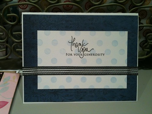
I used the moss/kraft combo for this card.  But to stay true to my original inspiration, I added ocean tides and dark chocolate.
Stamps: Turning a New Leaf (PTI), Wishful Elegance (Verve), Border Stamps (Stampabilities)
Paper: Kraft, Ocean Tides, Spring Moss (PTI)
Ink: Dark Chocolate, Ocean Tides (PTI)
Other: Marvy Scallop Punch, EK Success 1.5 inch Punch, Brown Grosgrain

Wednesday, March 17, 2010

Plum Pudding 4 Ways - Part 4

This is the final card of my Plum Pudding series.  I have really enjoyed the challenge of working with Plum Pudding (okay, yes, and technically kraft).  I stretched my self in so many ways.  For instance, I used an image stamp for the background - something I am not comfortable doing.  But, I loved the results and will do it again.  I also stamped onto patterned (albeit slightly) paper.  I stamped and cut out the images for a card.  Again, a technique that I haven't done a lot of.

So, all in all I had a great time.  I hope you enjoyed the cards even a percent of how much joy it brought me.


Stamps: Year of Flowers - Violets, Polka Dot Basics (PTI)
Paper: Kraft, Plum Pudding, Plum Pudding Bitty Dots, Spring Moss (PTI)
Ink: True Black, Plum Pudding, Spring Moss (PTI), Versamark
Other: Copic

Tuesday, March 16, 2010

Plum Pudding 4 Ways - Part 3

This is card 3 or 4 of my challenge to use Plum Pudding.  For the first card, I didn't use much purple.  On the second card, I flooded it with purple.  So, the next 2 cards will be splits.  Enjoy!

I went out on a limb again for this card and really enjoyed the process.  I framed the top portion with the white gel pen.  It wasn't nearly as scary once I committed to it.  And, I found another technique that I will definitely revisit.  Because I am pushing the envelope, so to speak, with my creative process, I have really enjoyed the results.  It has caused me to see things with a new, fresh eye.


Stamps: Background Basics: Diamonds, Signature Greetings (PTI)
Paper: Kraft, Plum Pudding (PTI)
Flower: Sprites 2 (Prima)
Pen: Signo White
Jewel: Dollar Tree

Monday, March 15, 2010

Plum Pudding 4 Ways - Part 2

I tried letter pressing with the Spellbinders Impressabilities on an earlier card I shared and really loved the effect.  So, I choose to try it again here as I really wanted to have a huge splash of purple.  It is the oddest thing.  Initially, the letter press, plum purple on plum purple, was gorgeous.  It was almost like the ink and the debossing faded with time.  You cannot really see it as bad in this photo.  So, while I still think the letter pressing technique is beautiful, I need to refine what I am doing.  I also broke out some Verve Stamps with this card (another new collection that I really like).  Further, I broke down and finally did the glitter line that I have seen Nicole from PTI do so many times.  I was nervous about it as I don't use/have the same adhesive tape she uses.  BUT . . . the outcome was the highlight of this card for me.  I loved how the glitter just clung to the adhesive.  WOW!  I will definitely revisit this idea again.


Stamp: Thankful Heart and Accents (Verve)
Paper: Kraft, Plum Pudding (PTI)
Ink: Plum Pudding (PTI)
Other: Impressability (Spellbinders), Punch (Marvy Scallop Pink)

I cannot remember what tape I use.  I will figure it out and update.

Sunday, March 14, 2010

Plum Pudding 4 Ways - Part 1

So, after making the Happy Birthday 2 Ways, I thought it would be fun to challenge myself.  Well, maybe not a "challenge" per se, but push myself a little.  There are several things I have a hard time being creative with or love and have never tried.  So, here in lies my newest challenge.  I love the PTI color, Plum Pudding or at least I do when I see it in others' works.  So, I challenged myself to put together some purple cards.  Here is the first one.  Enjoy!


Stamps: Giga Guide Lines, Big and Bold Wishes (PTI)
Paper: Kraft, Plum Pudding (PTI)
Ink: True Black, Plum Pudding, Lavender Moon (PTI)
Flower: Prima Sprites 2
Button: My Minds Eye
I got my feet wet with a touch of purple, but I didn't commit all the way.  My Plum Pudding didn't stamp as dark as I thought it would/should.  I think as I used it card after card, it got better.  This was a fun card to make and I loved the way the background finished.

Saturday, March 13, 2010

Basic Collection of Supplies

I have been reorganizing my craft room. Well, technically I have never stopped reorganizing my craft room since we moved in almost 4 years ago. Anyway, it has me thinking about crafting needs/wants and what I really use consistently. I am an avid fan of Papertrey Ink and more specifically Nicole. Papertrey puts its focus on delivering the best crafting basics. I read it all the time throughout her blog posts. So, I began to wonder what "basics" I needed in a crafting arsenal.

I realized quite quickly, with an honest heart and mind, that I was wasting money and precious storage space. Or more importantly, things I didn't use regularly had better real estate than a basic I reach for with every single project. For instance, I was using about 2 square feet of shelf space for a beautiful collection of prima flowers on risers and in matching glass jars in a quick and easy arms reach. I cannot remember the last time I reached for a prima - I have moved on from a once staple. My paper was in drawers that made it hard to get to and took up a lot of room because of the inefficiency of the storage device. So, it naturally was stored on a lower shelf where I had the room for the drawers but couldn't get to my paper easily.

Before I went out and bought any type of storage container, bin, box, bag, shelf . . . I needed to know what I wanted and how accessible it needed to be. So what do I need and what will I reach for over and over again? This past fall I started using and almost completely switched to Papertrey Ink products. And I had to basically start over. Most of us don't have unlimited crafting dollars (if you do, would you mind sharing the wealth?). Both questions inevitably have the basic same answer.

I highly recommend starting with the big paper sampler pack (no matter what brand you choose to go with). You will be surprised which colors you "thought" you loved until you get the product in your hand. I would drool over projects that Heather would create with Melon Berry. But, once I had the product in my hand, while it was a beautiful color, it wasn't my personal style or love.  I couldn't for the life of me see the rage that was Ocean Tides. But once I saw with my own eyes how beautiful it went with so many of the Papertrey colors, it is one of my must haves. Once you have figured out what colors you gravitate to then you can buy the colors you love and find yourself using the most in larger packs. Next, consider getting Kraft cardstock. It is a great neutral that I turn to over and over again. Last, but certainly not least is Stampers Select White card stock (pack of 40 - no kidding!!). Plain white can be used for so many things as well: stamp embellies, copic coloring focal points, background, cards bases - just to name a few. I do not consider pattern paper a necessity.

Basic brown and black inks are a necessity in my craftiness. I would also recommend getting a Versamark Water Mark ink pad. You can stretch your papers a long way by simply using Versamark on them - or tone on tone. Inks in general are basics for me. If you are just starting out or switching companies like I did, I would start with a couple of tried and true colors. Build your ink collection as your needs and style dictate.

Ribbon is the next most used item in my stash. If you are just starting out your collection, try using strips of cardstock in the place of ribbons (for now, I recommend buying the coordinating ribbon as you figure out what colors you want/need as you go, similar to how you build your ink collection). I have distressed the edges of the small strips to give the card stock more of a texture - like ribbon-ish. :)

You will definitely want to have coordinating buttons. Look around and see if you can find a sampler pack to start with. Papertrey Ink has two different starter sets. I don't think you should run out and get a whole set of coordinating buttons unless you KNOW you will be using them. I probably have enough buttons to match what I weigh - and most I cannot honestly say that I will use. Buttons go a long way!!! However, I find that I go through mountains of brown buttons. ??? So, get a few to get started and move forward cautiously.

A new staple for me is Copics. These can add up FAST! So, really work on your skills and build slowly over time with those colors you know you will use. Lots of people say to buy them in sets of 3 - Papertrey has a section for look-a-likes. I am sure you can find other brand's look alikes by googling.  

Where does the magic really begin? It begins with the stamp. Ooooh! :) The stamps you choose are the personality of the project. Stamps can be anything from a focal point to a subtile additive to adorable projects. My advice on stamps is to pick sets you can actually picture using over and over again. Personally, I constantly reach for Polka Dot Basics and Background Basics: Diamonds. It is a good idea to start with a couple of background sets, a sentiment set, and an image set or two. My rule of thumb is that I should imagine being able to use a particular stamp set on one card per dollar I spend (so if a set is $24, I make it a goal to make sure I would use the stamp set on at least 24 cards). Be realistic with yourself which is EXTREMELY hard to do when you look at so many talented stampers. Just because so-and-so made a jaw dropping card with a certain stamp doesn't make it a set you will go to more than once or twice.

Last, consider all the other things that you may find yourself turning to over and over. These are not necessarily considered basics in terms of supplies, but they could be basics for you. This could include glitter, felt, pattern paper, paint, dies, punches, etc. I personally use punches the most after the basics. Then, I find myself using die cuts and so on.


This priority of supplies tells me where I should be spending the bulk of my money. I have spent 100's of dollars on pattern paper only to end up giving much of it away two or three years later. No more. I will run out and buy the latest gadget (i.e. Cricut Cartridges) and only to use it once or twice. I believe that if you build on a good foundation, the rest will fall into place.

Happy Birthday 2 Ways - Part 2

This is the second way I did the Happy Birthday.  I used many of the same things and got a little bit different look.


Credits: Paper - My Minds Eye and Bazzil; Ribbon - May Arts; Stamp - Sillyleann 2.0; Punches - Marvy Scallop (Pink); EK Success (1.5 inch); White Signo Pen

Friday, March 12, 2010

Happy Birthday 2 Ways - Part 1

I was making this card and thought I would make 2 of the same one. However as the card went together, I only had enough stuff for only 1 - but I had already cut some of the paper. In my quest to use it or loose it, I pushed forward and made a second one. It was interesting how something so similar could be so different.


Here is the first card:

Credits: Paper - My Minds Eye and Bazzil; Ribbon - May Arts and Rabom; Flower - Prima; Stamp - Sillyleann 2.0; Ink - Enchanted Evening; Punch - Marvy (pink) Scallop and EK Success (1.5 inch)

Wednesday, March 10, 2010

Happy Easter


P1010684, originally uploaded by sillyleann.

Ready or not, Easter is coming . . . AND I am going to send out a few Easter cards. Yeah. I totally bombed on my Christmas cards. Ummm . . . I mailed them in January. So, it is a big deal that I am even going to send Easter cards AND on time. Now isn't that nice!! :)

Honestly, so much of what is on these cards is old and you probably cannot even get it anymore. I am in the "use it up" mode. I have really been updating my supplies and realize that I must use what I have first. Surely, you don't do that either, do you? Do you hoard things away until they are on the verge of going out of style? I didn't think so. *wink*

First Card:
Cardstock - Bazill; Ribbon - May Arts; Bunny and Alpha Die - Quickutz

Second Card:
Cardstock - Hobby Lobby textured cardstock; Bunny Die - Quickutz; "Hoppy Easter" Stamp - SillyLeAnn Designs 2.0; Flowers Stamps - Hobby Lobby (seasonal stamp set that they only had for Spring in 2007); Embossing Folder - Cuttlebug; Ribbon - Hobby Lobby (FX); Plaid Paper - My Minds Eye; Flowers are colored with Crafters Chalk

Monday, March 08, 2010

Thank You - again


IMG_3036, originally uploaded by sillyleann.
Thank you, blog readers! Thank you so much! :)

Another card from my creativity in February. Enjoy!

Credits:
Paper: Stampers Select White (PTI), My Minds Eye
Stamps: Signature Greetings, Polka Dot Basics (PTI)
Ribbon: JoAnn's (little rolls in the scrapbooking section)

Thank You


Thank You, originally uploaded by sillyleann.
I have a TON of cards that I haven't blogged yet. I am going to try to post a couple each week along with any new projects, cards, or random thoughts. :)

Here is a Thank You card that really turned out beautiful. It was impressive, but my photo taking abilities are lazy (in the sense of, I was too lazy to get up and get my camera, move to light and shoot, so I resorted to my iPhone).

Credits:
Stamps: Giga Guidelines, Guidelines (PTI)
Ink: Versa Mark, New Leaf (PTI)
Paper: Dark Chocolate, New Leaf (PTI)
Flower: Paper Studio
Other: Button (PTI), Ribbon (Hobby Lobby)

Sunday, March 07, 2010

Color Challenge from Verve


Oh, the colors were so inspiring.  I had fun with this card by trying some new things I haven't done.  It was sooooo much fun!!  Thanks for looking and I hope you enjoy!

So, do you see the background?  Of course you do.  :)  I letter pressed it with Spring Moss ink and Spellbinders embossibilities.  I will definitely revisit this technique.  I wish I took the time to take a better photo.  It is clean and gorgeous.  
Credits: Stamps - Butterfly Dreams, Fillable Frames #1 (PTI); Paper - Stampers Select White, Lemon Tart Bitty Dots (PTI), Ink - Dark Chocolate, Spring Moss (PTI); Die Cut - Fillable Frames #1 (PTI); Ribbon - Hobby Lobby

Sketch Challenge from Verve


I am usually not one for sketch challenges.  I can honestly say that the colors on this sketch are what caught my attention and begged me to play along.  So, I took it VERY literal and was super excited about the outcome.  Thanks for looking!!
<
Credits: Stamps - Scripture Stamp (Verve - Plain Jane), Damask Designs and Polka Dot Basics (PTI), Paper - Aqua Mist, Spring Moss, Dark Chocolate, Lemon Tart Bitty Dots, Stampers Select (PTI), Ink - Aqua Mist, Dark Chocolate, Spring Moss (PTI), Circle Punch - EK Sucess 1.5 inch, Scallop Punch - Purple Marvy Uchida


It is no secret that I am a total crazy about Papertrey Ink.  It is borderline obsessive.  :)  However, I have found a new slight obsession when it comes to stamps.  Verve!  I love, LOVE, love all of their scripture stamps.  That is what got me hooked.  With their newest release, I felt inspired and played along with some of the challenges.  This is the clean and simple flower challenge.  Enjoy!  And thanks for looking as always!


Credit: Stamps - Wishful Elegance (Verve), Copics, Dark Chocolate Ink (PTI), Ribbon - Hobby Lobby

Monday, March 01, 2010

Spring

Spring . . . oh the thought of Spring sure brings happiness to my soul.  I was so thrilled to see Papertrey's challenge with spring colors.  Here is my card using Betsy's colors.


Credits:  Paper - Stamper's Select White (PTI), Stamps - Background Basics: Petal Power, Turning a New Leaf, Damask Designs and Polka Dot Basics (PTI), Ink - Sweet Blush, Raspberry Fizz, Summer Sunrise, and New Leaf (PTI); Ribbon - New Leaf Bitty Dots and Raspberry Fizz Satin (PTI); Punch - Scallop Square (Marvy Uchida)

It turned out a little disjointed.  Why did hers turn out so beautiful for mine to be blah?  I guess we see why she is the color/card queen.  :)  My idea looked way better in my head.  Maybe I will try again and update.  (we'll see because the Bachelor finally is on tonight)


Note: Sorry if this appeared blank.  I posted this while in the car line (from my iPhone) and somehow it ended up blank.  ??? But, I think it is all fixed now.